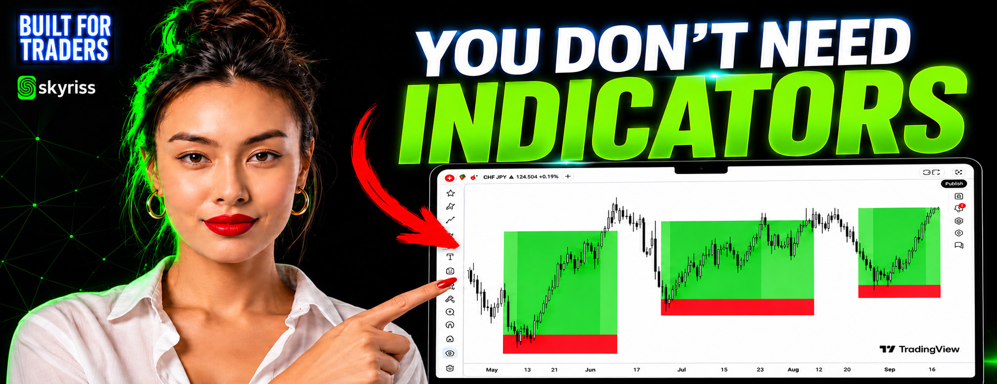

The Built For Traders Podcast is the official trading education podcast by Skyriss. It focuses on the real side of trading: the mistakes traders repeat, the concepts they misunderstand, and the habits they need to make clearer decisions in the market.
Rather than relying on vague market commentary, unrealistic promises, or simplified trading rules, each episode explores the practical realities traders face when real money, uncertainty, and emotion are involved. The podcast covers risk management, price action, trading psychology, market structure, leverage, strategy testing, market news, and discipline.
In Episode 2, “What Price Action Actually Looks Like,” Maya and Adam examine one of the most common habits in modern trading: adding more indicators whenever uncertainty appears. The episode is built around a difficult question: are traders adding indicators because they need more information, or because they want something else to give them permission to enter?
Almost every trader recognises the moment. A setup appears. The chart looks promising. The trader prepares to enter, but just before clicking, they hesitate. Then they add another indicator.
Perhaps they already have a moving average, the Relative Strength Index, volume, Bollinger Bands, or a momentum oscillator on the chart. But instead of creating certainty, the additional tool creates another condition that must be satisfied. The trader waits for one more crossover, one more signal, or one more confirmation.
The problem is not always a lack of market information. Sometimes the trader is looking for emotional reassurance. A clean chart forces the trader to make a decision based on what is happening directly in front of them. There is no green arrow telling them to buy, no red signal telling them to sell, and no external tool accepting responsibility for the outcome. That can feel uncomfortable.
Indicators may help organise information, highlight conditions, or support an existing analysis. But when traders continue adding them because they are afraid to make a decision, the chart becomes more complicated without necessarily becoming more useful. The search for confirmation can gradually become a search for permission.
Many popular trading indicators are calculated using price data. A moving average, for example, takes a selected number of previous prices and calculates their average. A 20-period moving average generally reflects information from the previous 20 periods.
The moving average can help traders visualise the broader direction of price or filter short-term noise. However, it is still calculated from candles that have already formed. The market moves first. The moving average responds afterward.
The Relative Strength Index, commonly known as RSI, also uses recent price changes in its calculation. It can help traders evaluate the speed and strength of recent price movements, but it does not exist independently from price.
This is important because traders sometimes believe they are receiving several separate confirmations when they combine multiple indicators. In reality, they may be examining the same underlying price information through several different formulas. A moving average, RSI, and another momentum indicator may appear to provide three independent opinions, but all three may be responding to the same historical movement.
That does not make indicators useless. It means traders need to understand what the tools are measuring and where the information originally came from. Price is the source. The indicator is an interpretation of that source.
Price action trading is the process of analysing the movement of price directly, usually through candlestick behaviour, market structure, momentum, and reactions around important areas. A price-action trader does not necessarily ignore every technical tool. The key difference is that the trader begins with price rather than beginning with an indicator.
The first questions are not whether RSI is overbought, whether the moving averages crossed, or whether an indicator produced a signal. The first questions are:
This approach places the live chart at the centre of the analysis. Indicators may then be used as secondary tools, but they do not replace the trader’s ability to understand what price itself is showing.
Every candlestick contains four basic pieces of information: the opening price, the closing price, the highest price reached, and the lowest price reached.
The candle body shows the distance between the open and the close. A large candle body can indicate that one side of the market controlled that period more decisively. A smaller body may suggest hesitation, balance, or reduced conviction.
The wicks show where price travelled before being pushed back. A long upper wick can show that price moved higher but was unable to remain there: buyers pushed upward, but sellers responded strongly enough to force price back down. A long lower wick may show the opposite, where price moved lower but buyers stepped in and rejected the lower area.
One candle should not usually be analysed in isolation. Its meaning becomes clearer when it is viewed in relation to the candles around it, the broader trend, and the location where it formed. A rejection candle appearing randomly in the middle of a range may carry less significance than a similar candle appearing at a price area that has already produced several strong reactions. The candle is not simply a shape. It is a record of the struggle between buyers and sellers during that period.
One of the clearest ways to understand price action is through market structure. An uptrend generally develops when price forms a sequence of higher highs and higher lows. Price moves upward, pulls back without breaking the previous important low, and then continues to a new high.
A downtrend generally shows the opposite: lower highs and lower lows. Price moves downward, attempts to recover, fails below the previous important high, and then continues to a new low. This structure allows traders to identify direction without waiting for a moving average to confirm that the market has already moved.
Market structure also helps traders notice when a trend may be weakening. For example, if an uptrend stops producing higher highs, breaks a significant higher low, and begins forming lower highs, the character of the market may be changing. This does not automatically guarantee a reversal, but it gives the trader information that the previous structure may no longer be intact. The purpose of reading market structure is not to predict every candle. It is to understand the current condition of the market and recognise when that condition changes.
Momentum can often be observed through the size and behaviour of the candles. During a strong bullish move, traders may see several candles with relatively large bodies closing near their highs. Pullbacks may be limited, and price may continue moving upward with little hesitation. During a strong bearish move, large bearish candles may close near their lows while upward recoveries remain weak.
But momentum does not remain constant. As a move begins to lose strength, candle bodies may become smaller and wicks may become longer. Price may continue moving in the same direction, but each new push may require more effort and produce less progress. This can be an early sign that the balance between buyers and sellers is changing.
A trader relying only on a lagging signal may not react until the move has already weakened significantly. A trader reading price directly may notice the transition as it develops. The important point is not that every small candle predicts a reversal, since small candles can also appear during temporary consolidation. The trader must examine where the change is happening. Momentum fading near a previously significant resistance area may matter more than momentum fading in an unimportant part of the chart. Context gives the candle meaning.
Support and resistance are often presented as lines that somehow control the market. A more useful way to understand them is as areas where traders previously made important decisions.
Imagine price rising to a certain area and being rejected sharply. Traders who bought near the top may have been trapped. Sellers who entered there may remember the profitable reaction. When price returns to the same area, those participants may react again. Some traders may close old positions. Others may enter new ones. Some may attempt to defend the level because it worked previously.
This is why support and resistance can be viewed as market memory. The area matters because enough market participants remember what happened there.
Several factors can affect the significance of a price level.
An area that has produced several clear reactions may attract more attention than an area price has only touched once. Repeated reactions can show that buyers or sellers have consistently responded around that price. However, traders should also recognise that repeated testing can weaken a level. Each test may consume some of the orders defending the area.
Recent reactions may be more relevant than levels that have not been visited for a long time. Market participants, conditions, volatility, and sentiment can change. An area that mattered several months ago may no longer carry the same weight.
A sharp rejection that causes price to move away quickly may indicate stronger participation than a slow, uncertain drift. The speed and size of the reaction can reveal how aggressively buyers or sellers responded.
A resistance area inside a strong uptrend may behave differently from resistance inside a weakening or sideways market. No level should be analysed without considering trend, momentum, and current market structure.
Price does not always react to the exact same number. One rejection may occur a few points above a previous high. Another may happen slightly below it. This is why support and resistance are often better understood as zones rather than perfectly precise lines.
Markets contain spreads, volatility, different order sizes, and participants operating across multiple timeframes. Reactions can occur within an area without respecting the exact same price. A zone gives price room to behave naturally. Drawing every level as a single, exact line can cause traders to treat normal market movement as a failed setup or false breakout. The objective is not to identify a magical number. It is to recognise an area where market behaviour has previously changed.
A support or resistance level is not guaranteed to hold forever. When price approaches an established area and moves through it decisively, the break itself provides new information. It may indicate that the participants previously defending the area are no longer strong enough to stop the move. The market’s memory has changed.
Traders sometimes become emotionally attached to levels they have drawn. When price breaks through, they immediately label the move a fake-out because they do not want to accept that their original analysis may no longer be valid. A better approach is to observe the behaviour around the break. Did price close convincingly beyond the zone? Was momentum strong? Did price return to test the area? Did the previous support begin acting as resistance, or vice versa?
Support and resistance should be respected, but they should not be treated as promises. A level is a source of information, not an object of faith.
There is a simple test traders can perform. Remove every indicator from the chart and ask: can I explain what the market is currently doing?
Can you identify the direction? Can you locate the most important swing highs and lows? Can you recognise whether momentum is strengthening or weakening? Can you find areas where price has reacted repeatedly? Can you explain what would invalidate your current interpretation?
If the chart becomes completely unreadable once the indicators disappear, the trader may have learned the settings of their tools without fully learning how the market moves beneath them. That does not mean every indicator must be permanently removed. The goal is independence. A trader should be able to analyse price first and then decide whether a technical tool adds useful context. When the indicator becomes the primary source of analysis and price becomes secondary, the process has been reversed.
Price is the underlying market data. The indicator is a calculation based on that data. When price behaviour and an indicator appear to disagree, traders should first examine what price is actually doing.
Has market structure changed? Did price break an important level? Is momentum expanding? Are the candles showing strong rejection? Is the indicator responding to older data while current conditions are developing differently?
This does not mean traders should automatically ignore every indicator signal. It means the tool should be interpreted in context. An oscillator can remain overbought while price continues rising strongly. A moving average can continue pointing upward even after short-term structure begins weakening. Indicators describe selected aspects of market behaviour. They do not replace the full chart.
A clean chart does not only reveal the condition of the market. It can reveal the condition of the trader. It shows whether the trader can wait when there is no clear setup, whether they can accept uncertainty without forcing a trade, and whether they can acknowledge that a trend has changed, a level has broken, or an analysis has become invalid.
It shows whether they are reading the chart or searching for evidence that supports what they already want to believe. This is why trading can feel psychologically uncomfortable. The trader may believe the market is testing their analytical ability, but the deeper test is often emotional. Can they remain patient? Can they act without perfect certainty? Can they accept being wrong without immediately attempting to recover the loss? Can they change their view when the chart changes?
No indicator can create these qualities. A trader cannot download patience, install discipline, or adjust a setting that removes fear. Technical tools can support a process. They cannot replace the person responsible for following it.
Price action does not usually provide a perfect answer. It presents a situation and requires the trader to interpret it. The market may be trending, but approaching resistance. Momentum may be strong, but volatility may be increasing. A level may have produced several reactions, but it may also be weakening after repeated tests. The trader must weigh the evidence and make a decision without knowing the outcome in advance.
That responsibility is difficult. A mechanical signal can make the trader feel less alone. If the trade fails, they can blame the indicator, the strategy, or the signal provider. Reading price requires the trader to accept that uncertainty is part of every decision. The skill is not knowing with complete certainty what the market will do next. The skill is reading what is happening now, defining the risk, identifying what would make the analysis wrong, and remaining disciplined regardless of the outcome.
Traders can begin with a simple clean-chart exercise. Choose one market and one timeframe. Remove the indicators and study only price.
Identify the Structure
Mark the major swing highs and swing lows. Decide whether the market is forming higher highs and higher lows, lower highs and lower lows, or no clear directional structure.
Observe the Momentum
Compare the size of recent candle bodies. Look for expanding candles, shrinking candles, long wicks, hesitation, and sudden changes in the strength of the movement.
Mark Important Reaction Zones
Find areas where price has reversed, paused, or accelerated more than once. Draw zones rather than extremely precise lines.
Watch What Happens at the Zone
Observe whether price rejects the area, consolidates around it, or breaks through decisively. Do not predict the reaction before it happens. Read the behaviour as it develops.
Write Down the Invalidation Point
Before considering a trade, decide what price would need to do for the analysis to become invalid. This prevents the trader from changing the explanation simply because they do not want to accept being wrong.
The exercise is not about placing more trades. It is about training the eyes to recognise structure, momentum, and reaction without depending on an external signal.
Episode 2 is not an argument that every trader must delete every indicator. Indicators can help traders filter trends, compare momentum, study volatility, or build systematic trading rules. The problem begins when the trader no longer understands what the indicator measures or cannot make sense of the chart without it.
A tool should improve an existing process. It should not become a substitute for analysis, confidence, discipline, or responsibility. The strongest relationship between price and indicators is often a simple one: read the price first, use the indicator second.
In “What Price Action Actually Looks Like,” Maya and Adam go beyond basic candlestick definitions and examine why traders often hide behind indicators when the real issue is hesitation, fear, and the desire for certainty. The episode includes practical clean-chart analysis covering candlestick behaviour, trend structure, momentum, support and resistance, broken levels, and the psychology behind the pause before entering a trade.
It is for traders who have several indicators open but still feel uncertain, traders who struggle to identify market direction without a signal, and anyone who wants to understand the information price is already providing.
Built For Traders by Skyriss is created for traders who want more than surface-level market commentary. Each episode explores the habits, lessons, and realities that shape clearer decision-making in live markets. Watch Episode 2 of Built For Traders and learn how to examine the market at its source.